

- Build in the crate
- 2.4 [MAS]
- Made by the team at
- App ahead GmbH
- Menu languages offered
- English, German, Spanish, Italian, Chinese (Simplified), Korean, French, Japanese
- How you pay for it
- K'ed by TEAM HCiSO
- macOS it plays on
- macOS 11 or later
- CPU it runs on
- Apple Silicon, Intel 64-bit
Screenshots
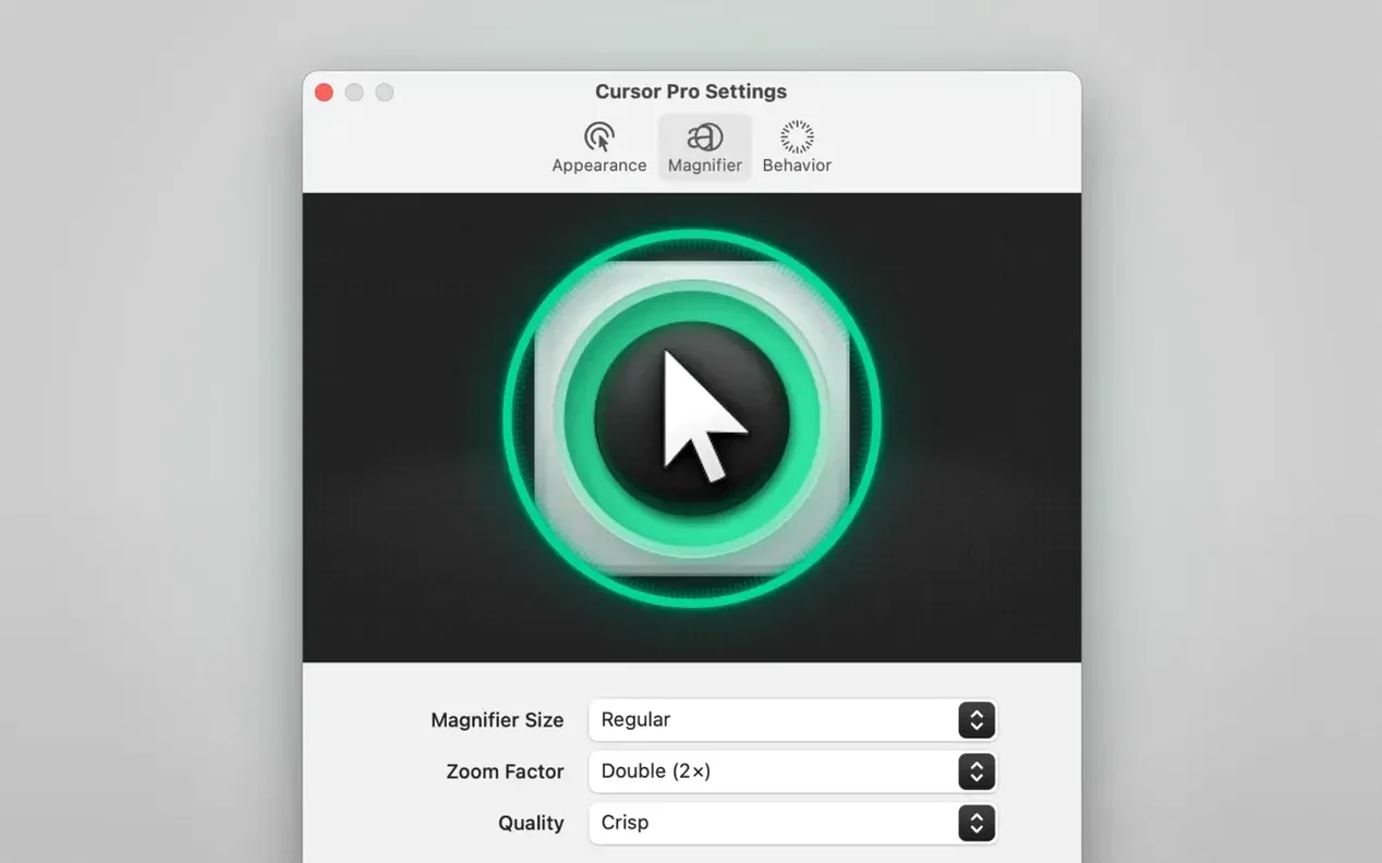
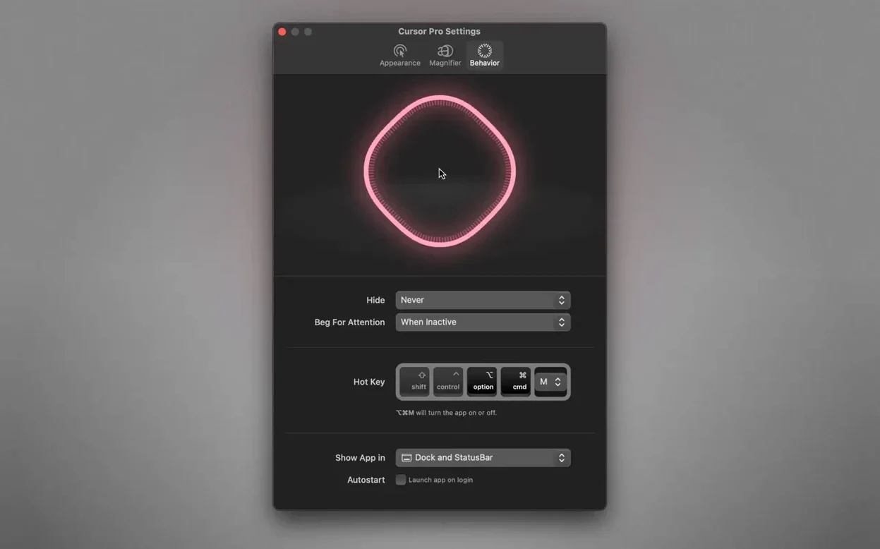
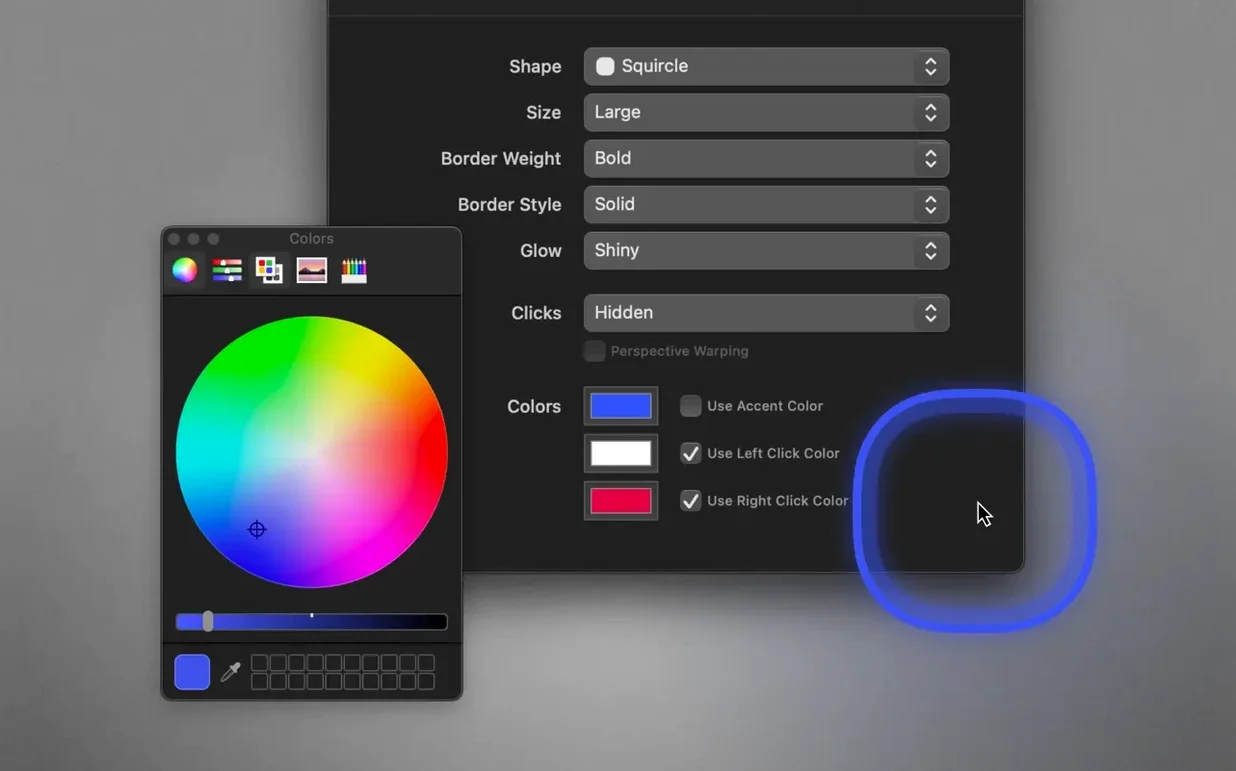
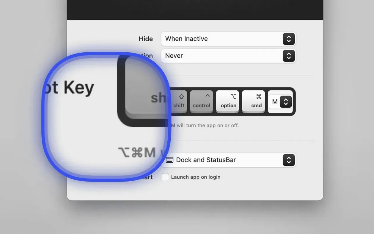
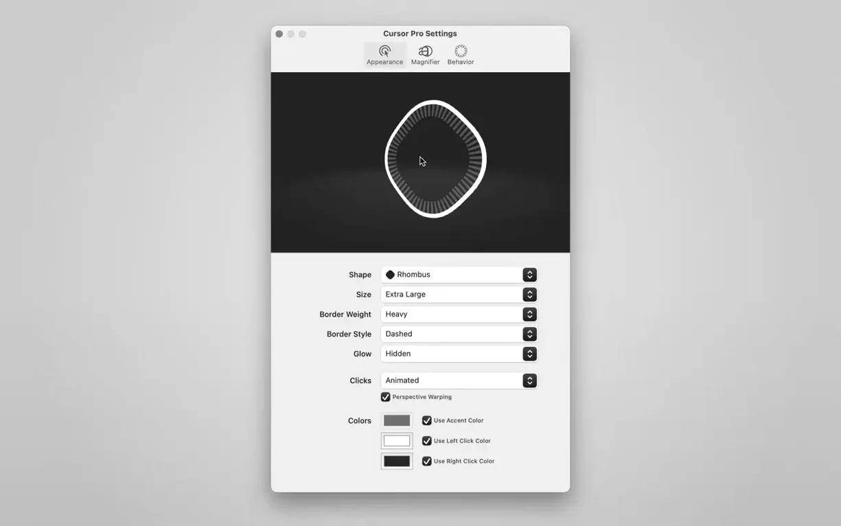
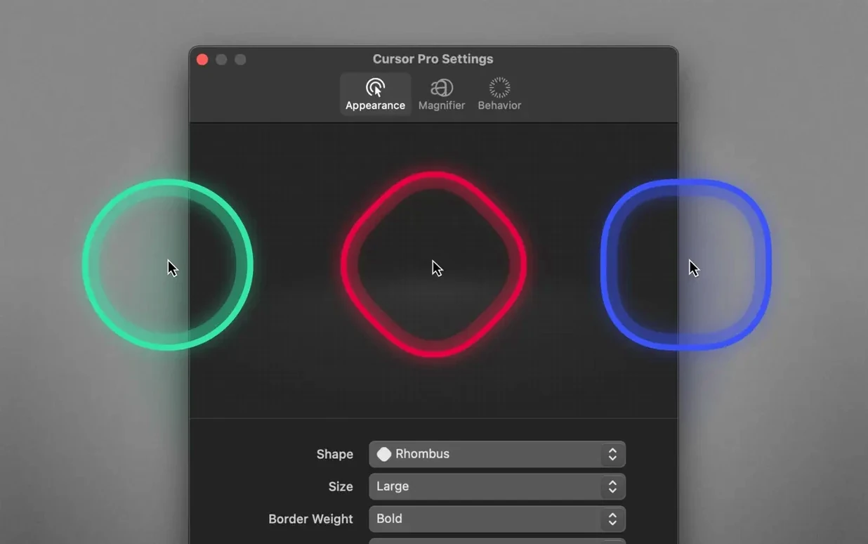
Pulse mode. That is the feature that grabbed me first. The cursor pulses a soft ring outward so everyone on a video call or in a lecture hall can follow exactly where you are pointing. No more squinting, no more “where is your mouse?”
Highlight the pointer on a big display
When you work on a large screen or share your desktop, the default arrow disappears. Cursor Pro wraps your pointer in a customisable shape — circle, square, whatever you choose — and keeps it visible at all times. The colour and size are yours to set.
Magnify screen content on the fly
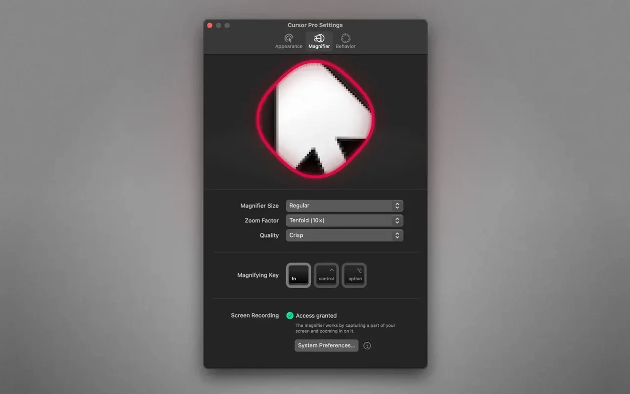
The built-in magnifier zooms into whatever is under the cursor. Configure the zoom factor once, then trigger it during a presentation to show fine detail without opening another app. It works alongside the highlight, not instead of it.
Stay ready with menu-bar access and auto-launch
The app lives in the macOS menu bar. Set it to launch automatically at login, and it is there every time you present or teach. No setup, no fumbling for the dock.
Shape switching now hesitates less
The latest update keeps the same core workflow but polishes the parts you use every session. The highlight shapes now feel more responsive when switching between circle and diamond — the old version sometimes hesitated when you changed shape mid-presentation. The magnifier also gained a wider zoom range, so you can pull in a tiny graph or code snippet without losing clarity around the edges.
The auto-hide behaviour was tweaked too. Earlier builds would hide the highlight the moment you stopped moving the mouse, which meant the ring disappeared exactly when a viewer looked back at the screen. Version 2.4 waits a fraction longer before fading, making it easier to keep attention on the cursor without fiddling with the settings every few minutes.
Shape choice for dense slides
Most people install Cursor Pro and leave the defaults alone. A few minutes of setup makes a real difference in a live session.
- Pick the right shape for your content. The diamond works well on dense slides because its corners point exactly where the cursor sits. The circle is better for screen recordings where you want a softer, less distracting ring around the pointer.
- Set a colour that contrasts with your typical background. If you present white slides, a dark ring with a faint glow stands out without washing out. Teaching a dark UI or terminal? Switch to a lighter colour and add a bit of glow so the highlight doesn't blend into the interface.
- Choose the zoom factor once and test it. A 2x zoom is enough for most slides and code. If you work with detailed diagrams or small UI controls, bump it to 3x or 4x and check that the magnified area still fits on the screen without hiding the rest of the window.
- Decide where the app appears. The status bar keeps it out of the way; the dock makes it easier to find if you switch apps often. Both options are fine, but picking one early stops you hunting for the icon mid-presentation.
Missing global hotkey by default
Three habits trip people up during their first week with Cursor Pro.
Forgetting to assign a global hotkey. The app supports a hotkey for toggling the highlight and magnifier, but it is not set by default. If you rely on clicking the menu bar icon every time, you will lose the rhythm of your presentation. Map a key you can hit without looking — F1, option-space, whatever feels natural — and test it before you go live.
Leaving the highlight on all the time. The ring is great for pointing, but it can distract if it stays visible during every mouse move. Enable auto-hide so the highlight fades when you are not actively using it. The cursor still shows the standard arrow; the ring only appears when you move or click. That small change keeps the screen clean and the audience focused on the content, not the pointer.
Not testing the magnifier with real content. The zoom looks fine on a blank desktop. Open a crowded slide or a detailed interface and try it. The magnifier enlarges whatever is under the cursor, which means you need to adjust your screen layout so the zoomed area does not block the part you are explaining. Move your content to the left or right of the screen before you start, and the magnifier becomes a tool instead of a hindrance.
- macOS 11 or later
- Intel or Apple Silicon
Kit check at a glance
| System | macOS 11 or later |
| Chip | Apple Silicon, Intel 64-bit |
| Download | 30 MB |



Chat from the booth
Sign in or grab a free account to leave a comment.
Nobody has said a word in the booth yet. If you played a set with this build, tell the next person how it went.